
July 21, 2025
Article
The Mobile-First Imperative for Local Businesses
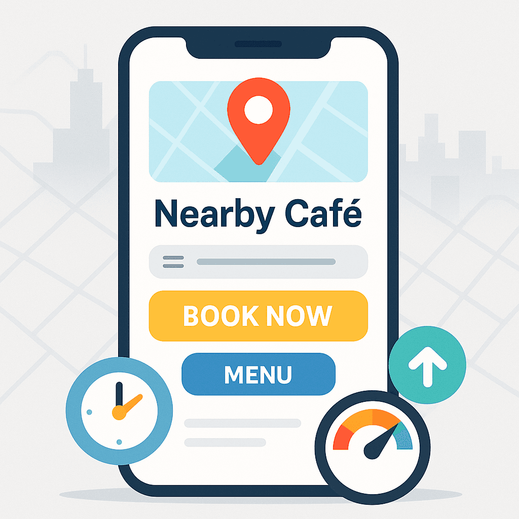
In today’s world, more people search for and interact with local businesses on their smartphones than ever before. Whether customers are looking up a nearby café, booking a salon appointment, or checking a studio’s class schedule, their first touchpoint is almost always a mobile device. For local businesses, adopting a mobile-first approach isn’t just a nice-to-have—it’s essential to reaching customers, driving bookings, and staying competitive.
Why Mobile Matters More Than Ever
Mobile usage dominates local search: According to Google, over 60 % of all restaurant searches and 70 % of “near me” queries happen on mobile devices.
Immediate intent: Mobile users often look for quick answers—directions, menus, hours—so they expect sites that load fast and present information clearly.
Conversion rates rise on mobile: A smooth mobile experience can boost reservations, bookings or inquiries by 20–30 %, simply by removing friction.
The Pitfalls of Desktop-First Design
Many small businesses start by designing a “nice” desktop layout and then squeeze it onto a small screen. This approach leads to common frustrations:
Tiny tap targets: Buttons and links that work fine with a mouse become impossible to use with thumbs.
Cluttered layouts: Sidebars, large image carousels or multi-column content get crammed and force excessive scrolling.
Slow performance: Desktop-oriented images, scripts and fonts slow down mobile load times—driving users away.
When visitors struggle to find what they need, bounce rates spike and conversions plummet.
What Mobile-First Really Means
A mobile-first mindset prioritizes the smallest screen from day one. Instead of designing for desktop then adapting, you:
Start with mobile layouts: Define how key sections—hero image, services, booking button—stack and flow on a phone screen first.
Design thumb-friendly interactions: Ensure tap targets are at least 44×44 px and place important buttons within easy reach (bottom-center or bottom-right).
Optimize performance: Compress images, lazy-load offscreen content and trim unnecessary code to hit sub-3 second load times on mobile networks.
Progressively enhance for larger screens: Once the mobile foundation is rock-solid, layer on additional columns, hover effects or richer navigation for tablets and desktops.
Quick Wins for Mobile-First Websites
Even small tweaks can deliver big gains. Here are actionable steps any local business can implement today:
Simplify your navigation: Limit your top menu to 4–5 items and use a clear “hamburger” icon. Hide less-important links in a footer menu.
Prioritize key actions: Put your single most important CTA—“Book Now,” “View Menu,” “Schedule”—at the top of the screen.
Compress hero images: Use tools like TinyPNG or Squoosh to reduce file sizes below 200 KB without visible quality loss.
Lazy-load images and embeds: Delay offscreen photos and third-party widgets (like maps or reviews) until users scroll near them.
Test on real devices: Nothing replaces testing on an actual smartphone—check load times, tap targets and scroll behavior.
A Real-World Example
When Bella’s Bistro in Berlin shifted to a mobile-first redesign, they saw immediate results:
Load time dropped from 5.3 seconds to 2.1 seconds on 3G connections
Mobile bounce rate decreased by 30 %
Online reservations increased by 45 % within the first week
By condensing content to essential sections, optimizing images, and moving the “Book a Table” button into thumb-reach, Bella’s Bistro turned frustrated mobile visitors into satisfied, seated guests.
Long-Term Benefits
Adopting mobile-first isn’t just about immediate metrics. It sets the stage for:
Better SEO: Google uses mobile-first indexing, so a mobile-optimized site ranks higher in local search.
Scalability: A solid mobile foundation makes it easier to add features—blogs, e-commerce, loyalty sign-ups—without overhauling your design.
Customer loyalty: Fast, frustration-free mobile experiences build trust and encourage repeat visits, both online and in-store.
Next Steps
Audit your current site on a real smartphone: note load times, tap-target sizes and content flow.
Apply the quick wins above to tackle low-hanging fruit.
Consider a full mobile-first redesign to lock in long-term performance and growth.